Brand Guidelines
BRAND EXPERIENCE
Our brand experience encompasses every interaction a customer has with our company, products, services and people. The strength of our brand relies on maintaining consistent, clear written and visual elements in all our communications. In these Brand Guidelines, you will find tools and info to assist you in maintaining visual integrity and meaningful brand experiences.
Brand Belief
The relationship between plants and people is one of personal discovery and must always be mutually beneficial
BRAND PLATFORM
BRAND PILLARS
- Passionate, Authentic, Adventuresome
- Nature
- Discovery
- Human Needs
BRAND BELIEF
- Passionate (conscious, involved)
- Innovative (optimistic, forward looking )
- Responsive (caring, personal)
- Empowering (teachers, heroic)
- Trusted (credible, reliable)
COMMUNICATION
- Passionate
- Authentic
- Adventurous
- Mindful
- Friendly
- Energetic
- Fun
Brand Why
Make the healing power of nature accessible to everyone.
BRAND PROMISE
Discover the true spirit and new science of herbs.
MODERNIZING OUR LEGACY
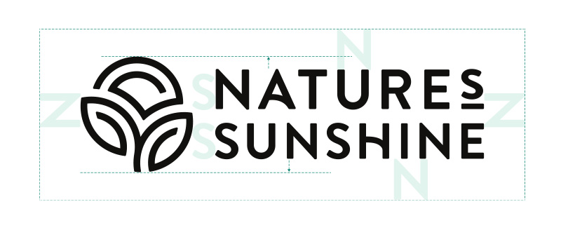
Our icon is a nod to our past and was designed to represent the sun, fields and botanicals that have been a part of our logo since the beginning. The icon was designed to work with and without the wordmark. It can also be used as a watermark, shown solid or outlined or incorporated into the background as a pattern.


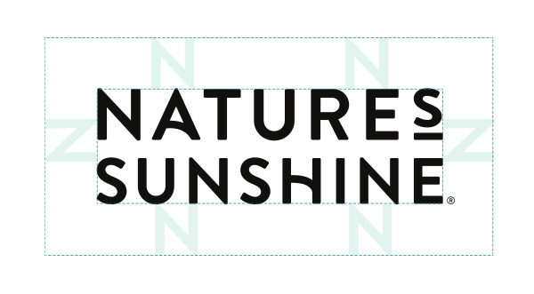
WORDMARK
Our wordmark is a bold, clean, readable type treatment that is versatile and scalable. It features a unique underlined ‘S’ instead of an apostrophe, custom curves on the A and H and slightly rounded edges. It was intentionally designed to work with and without the icon.
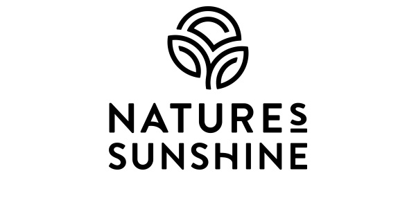
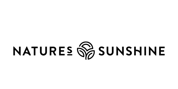
ACCEPTABLE LOGO USAGE
There are 3 options with the new Nature’s Sunshine logo. The preferred logo lockup is shown below. The scale of the icon in contrast to the wordmark should always be as shown never larger or smaller. Secondary and tertiary options follow.
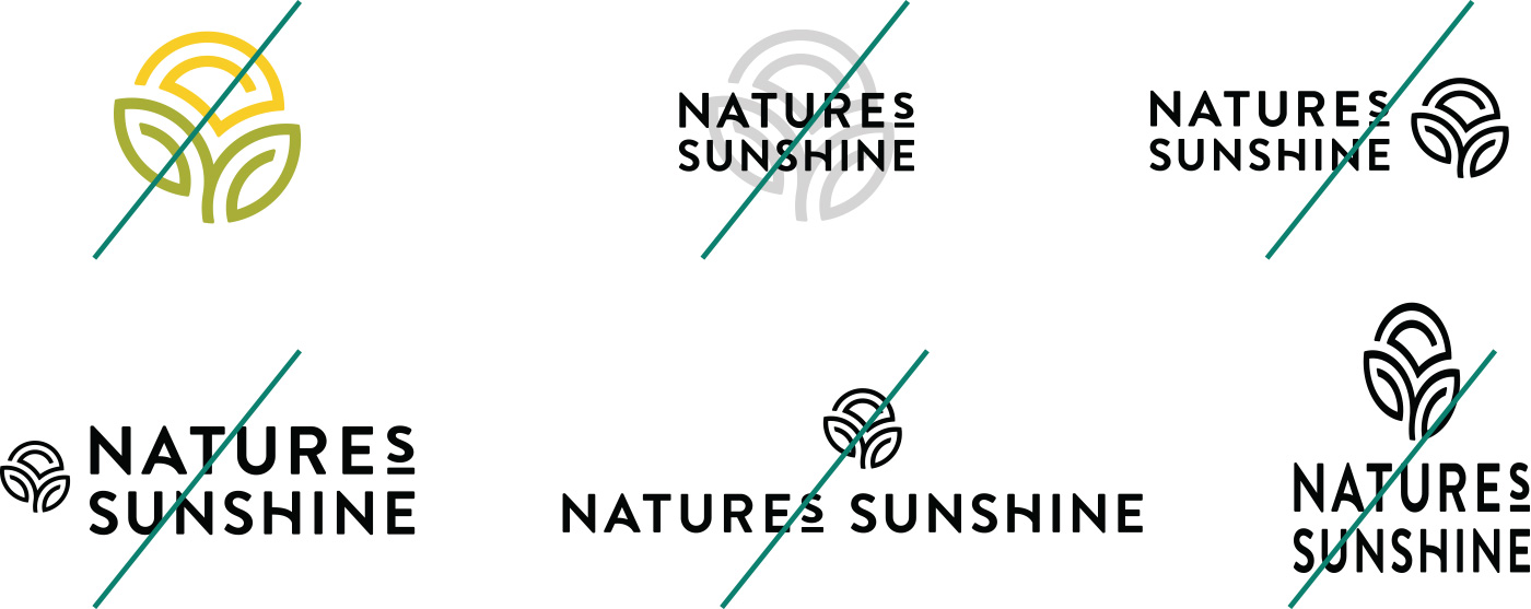
UNACCEPTABLE LOGO USAGE
To maintain logo integrity please do not resize or reorganize the icon or wordmark when they are combined into a lockup. Adhere to only the three lockups as shown above, maintain the strict sizing and composition. Do not condense, stretch etc. The icon should always be one color and not multiple colors.
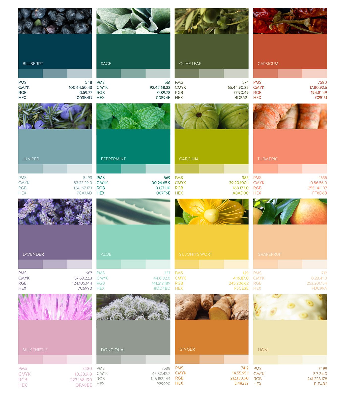
COLORS
Warm colors palletes pulled from nature will infuse the Nature’s Sunshine communications.
ICON PATTERN
The repeated icon pattern can be used sparingly as a texture element to reinforce and support branding. The texture should always be contrained to a box. See example below.
FONTS & USAGE

PHOTOGRAPHY – BOTANICAL TEXTURE
Utilize rich textures displaying blatant patterns and compositions of nature. This can include macro photography, dense nature scenes, vibrant colors that harmonize with our designated palette. Avoid the heavy presence of modern, man-made, or scientific elements in the photo where possible.
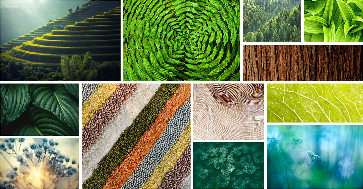
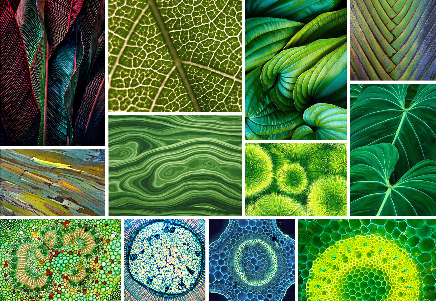
Nature as Community.
Not Commodity.
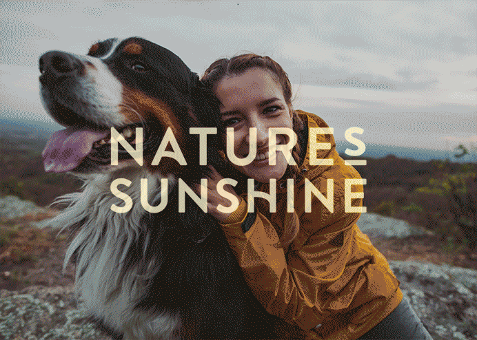
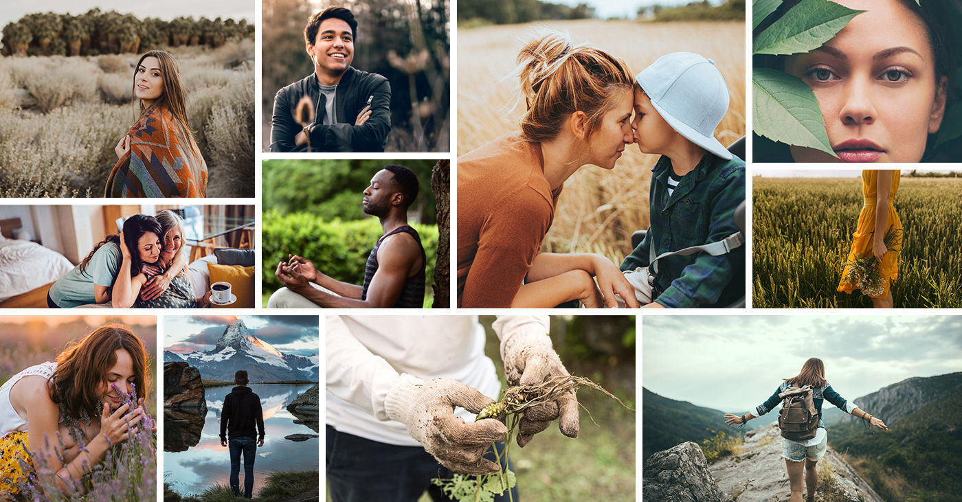
PHOTOGRAPHY – LIFESTYLE
Lifestyle photography will continue to be an element in Nature’s Sunshine branding. The people shown should reflect our voice. They should appear to be passionate, authentic, adventurous, mindful, friendly, energetic, and fun people, shown in environments that amplify that voice. Choose photos that show natural light, vibrant colors, and timeless fashions.
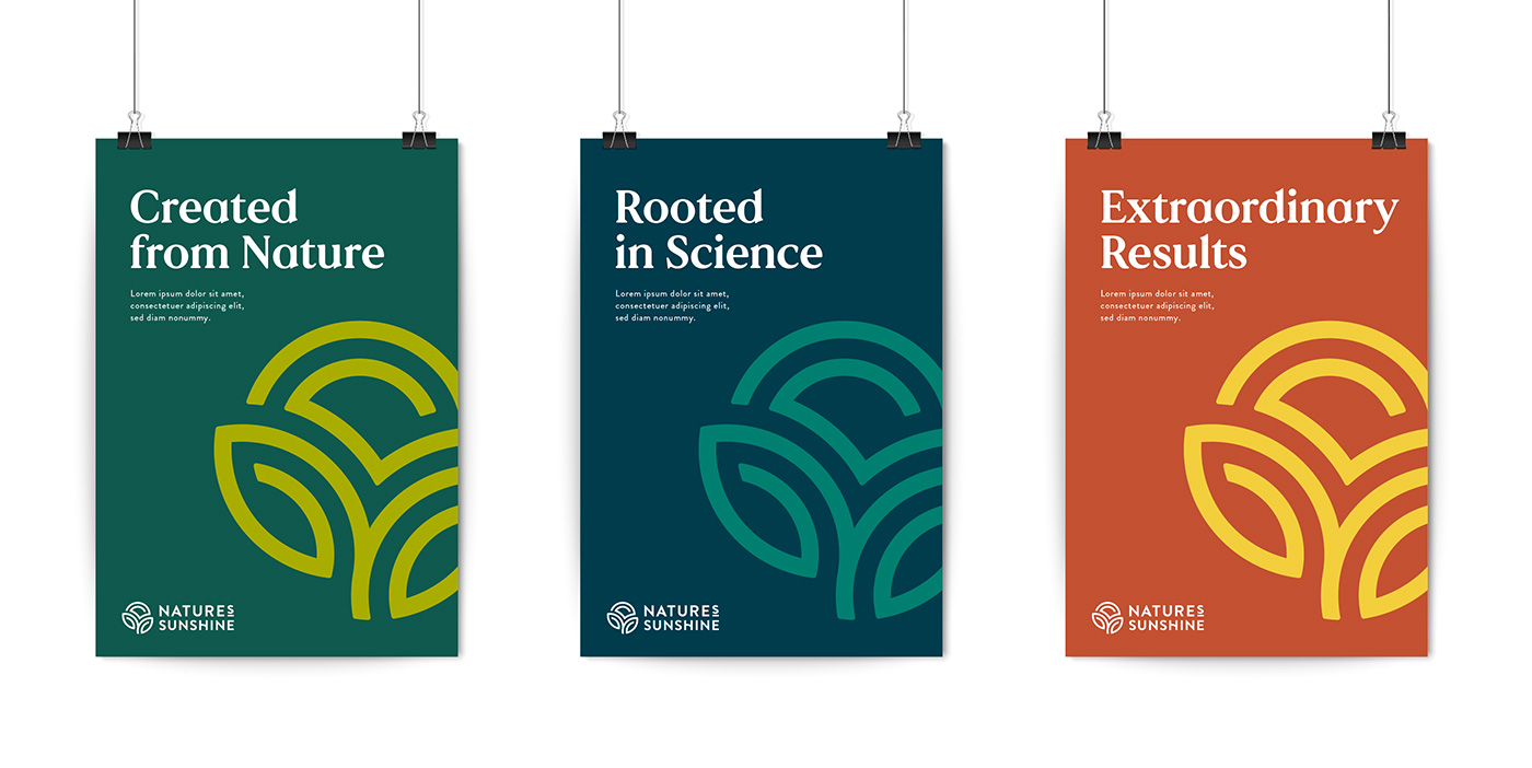
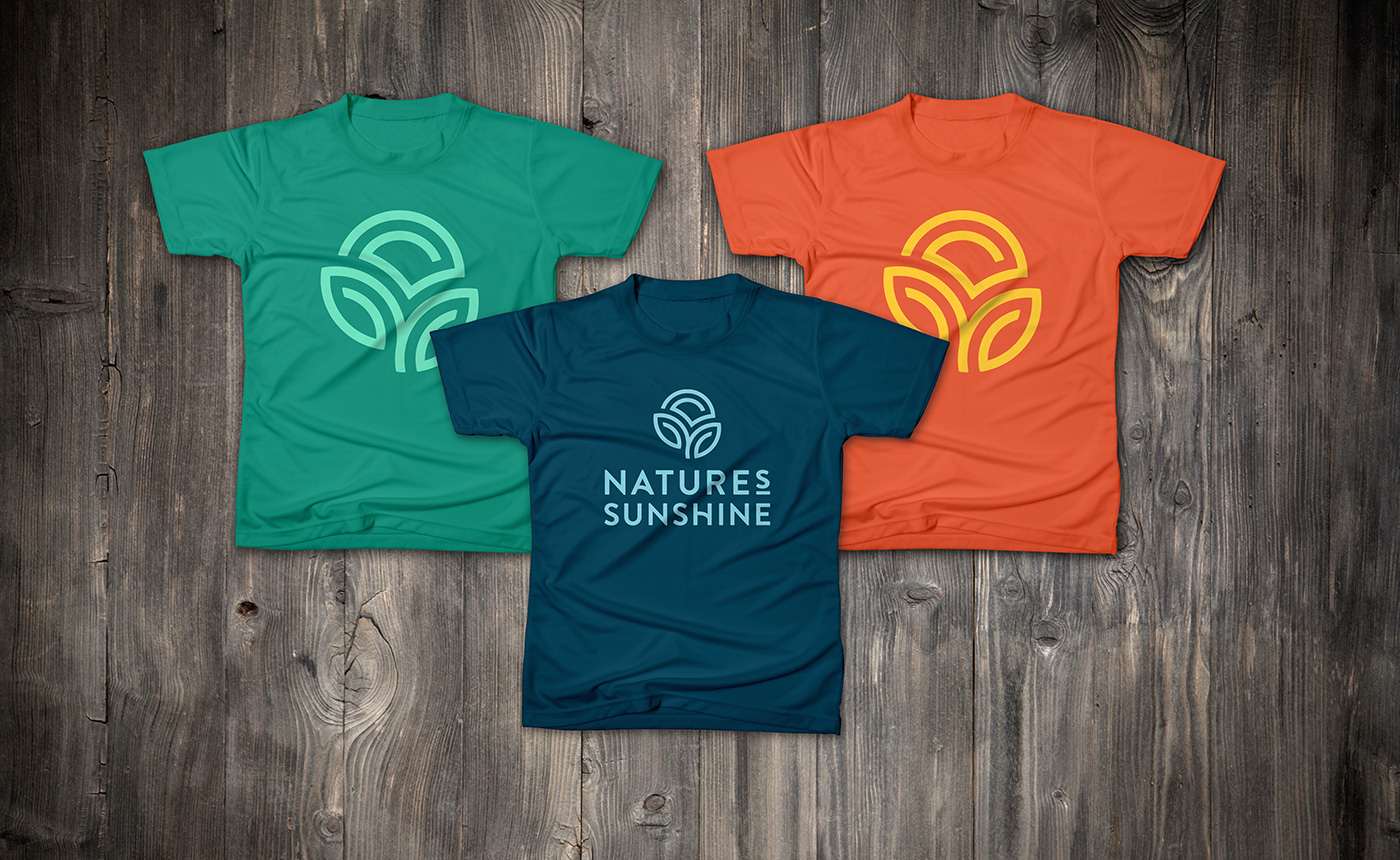
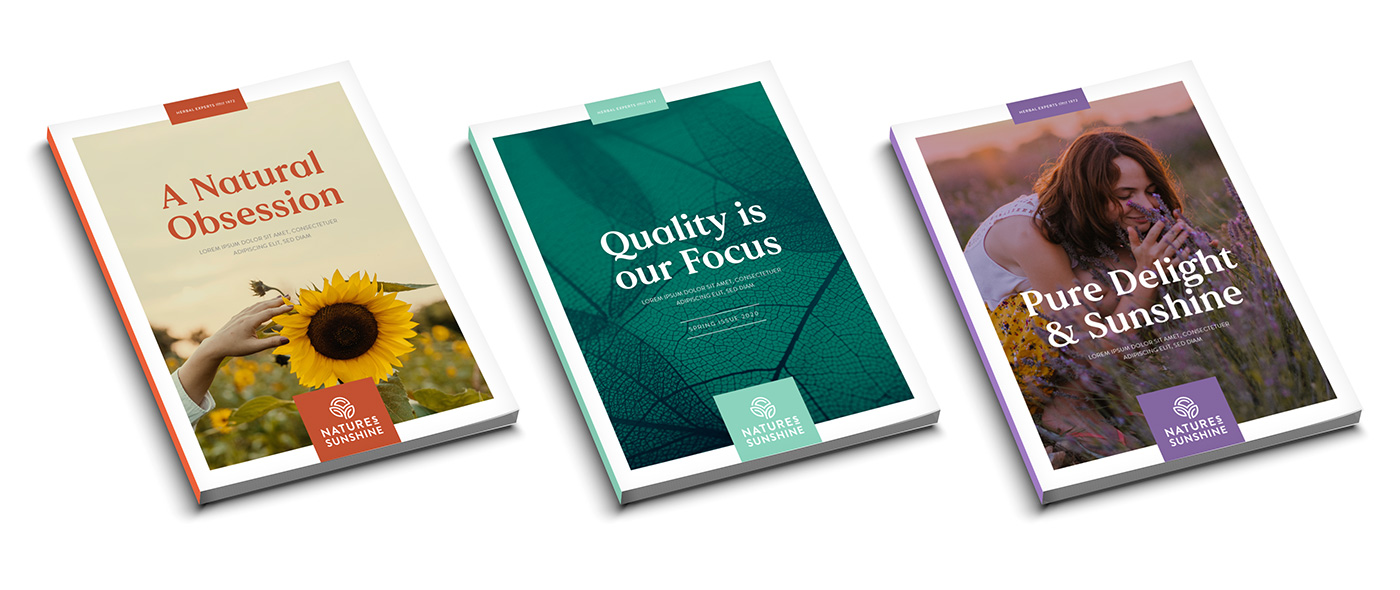
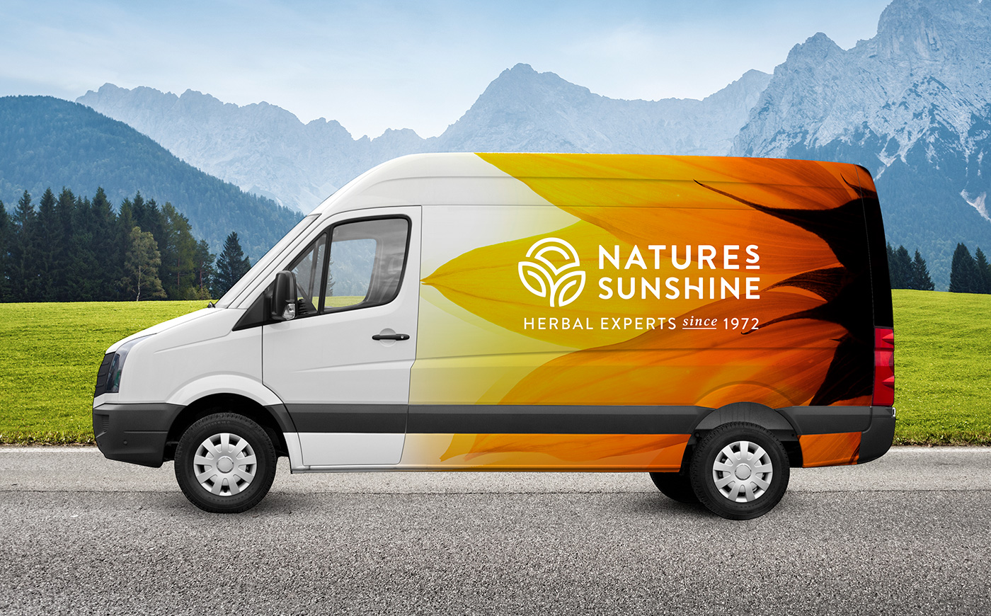
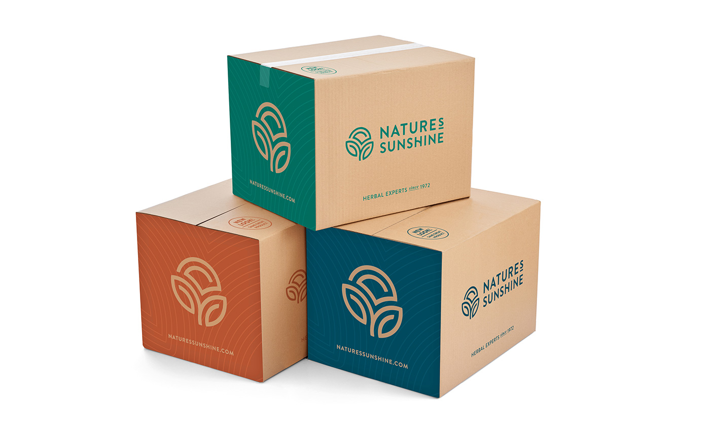
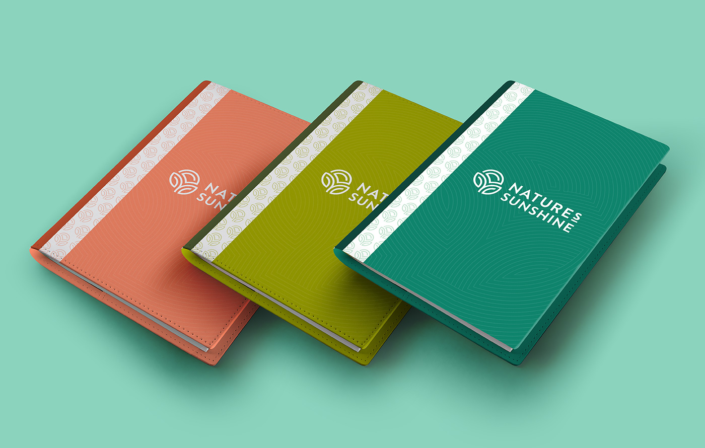
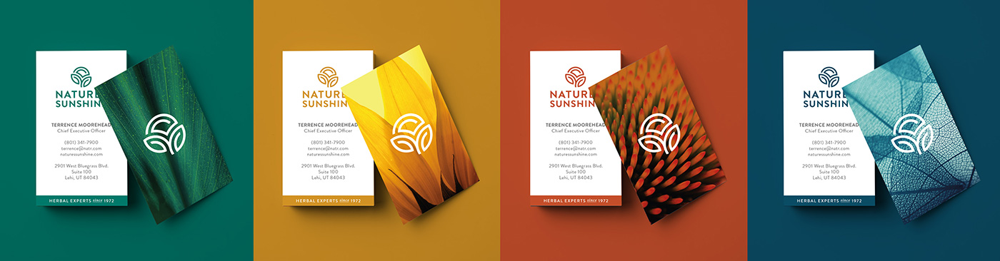
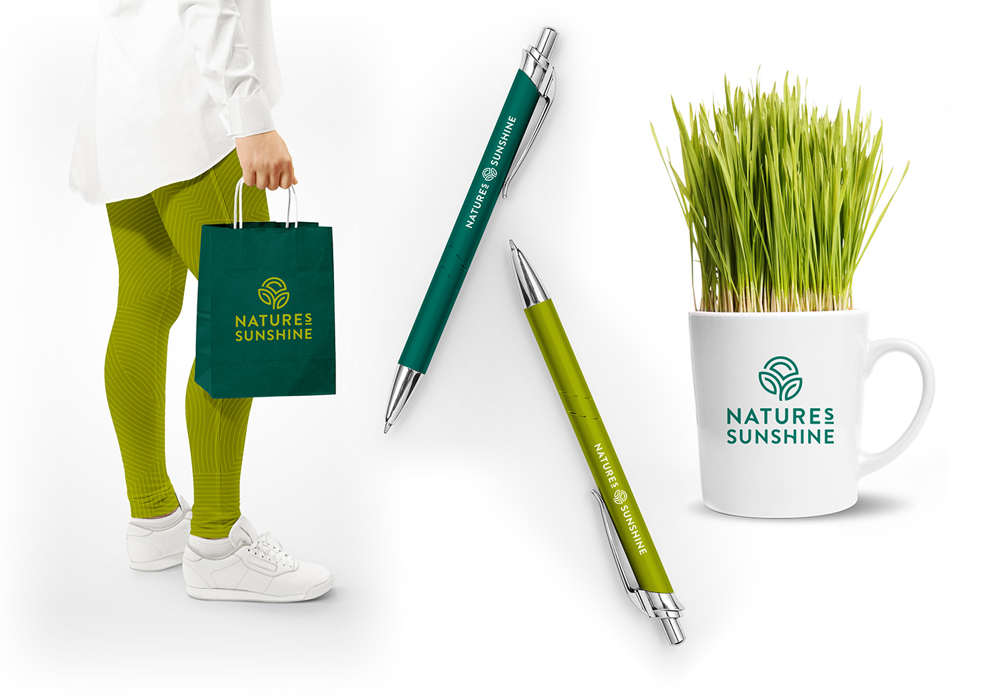
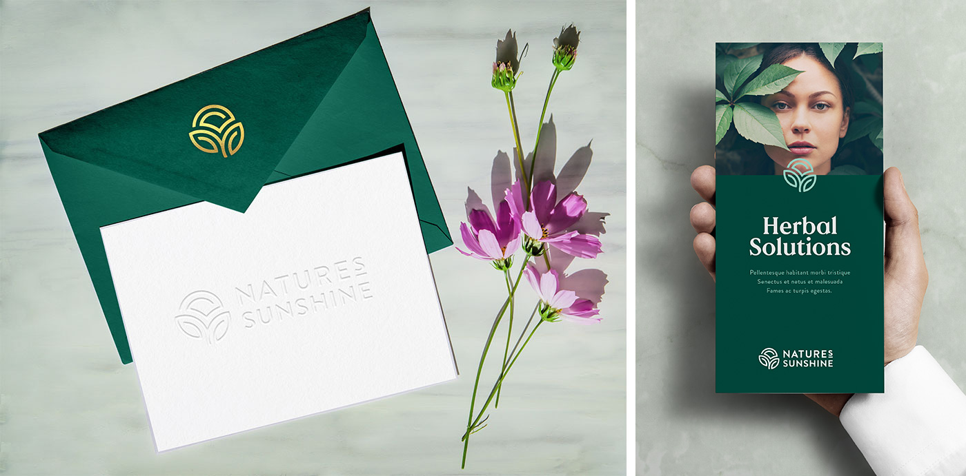
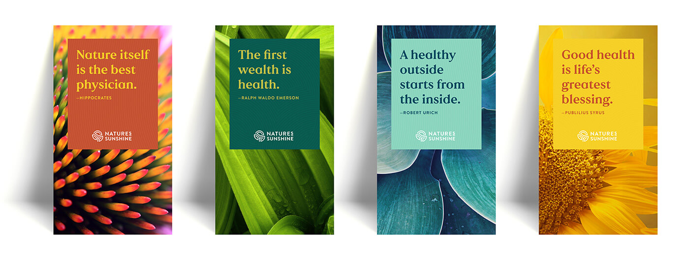
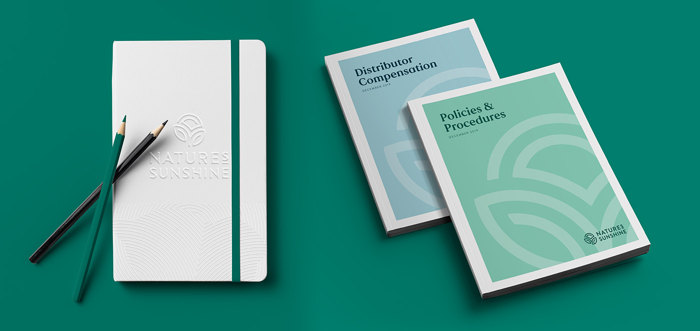
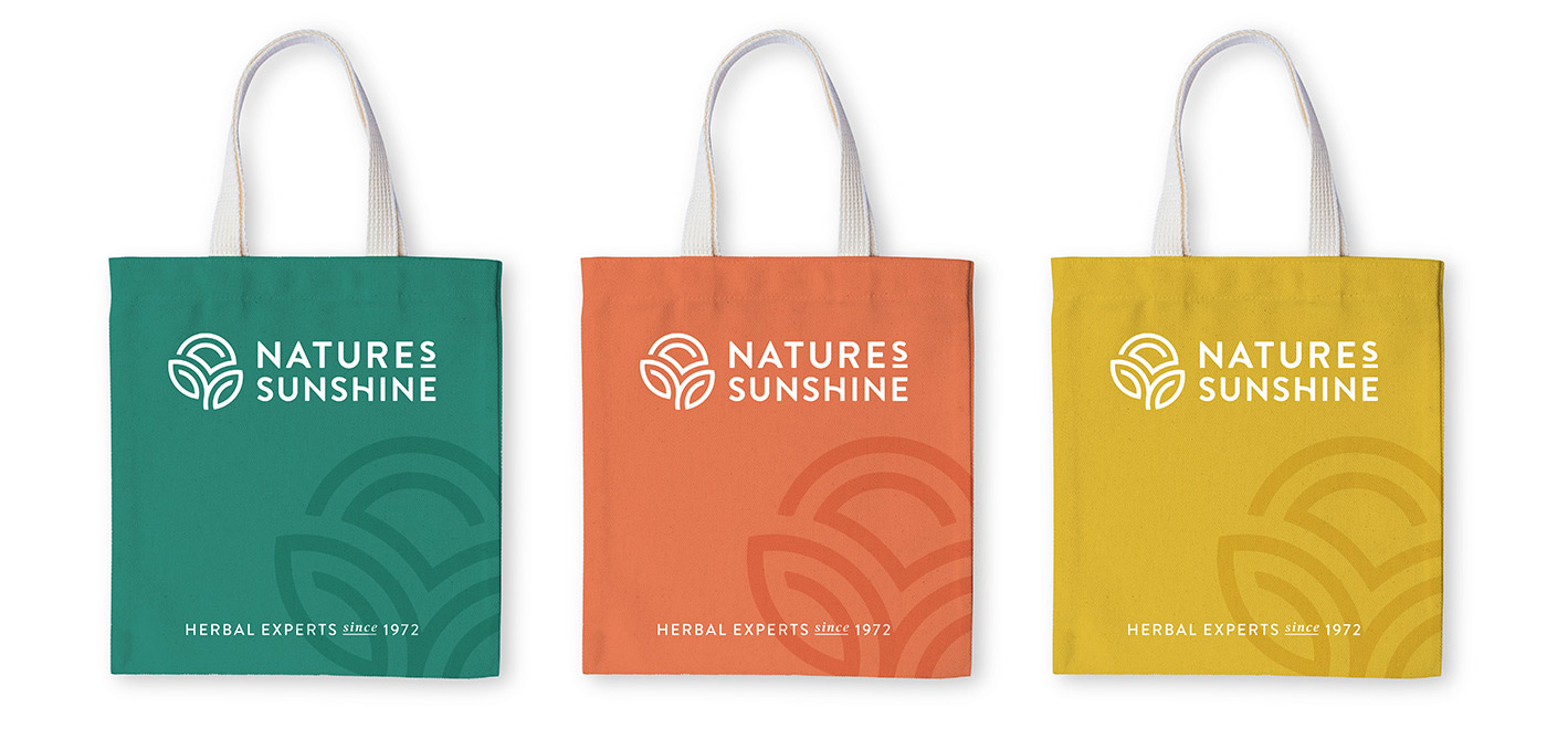
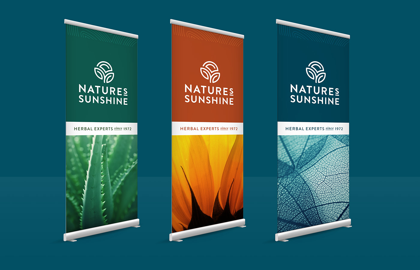
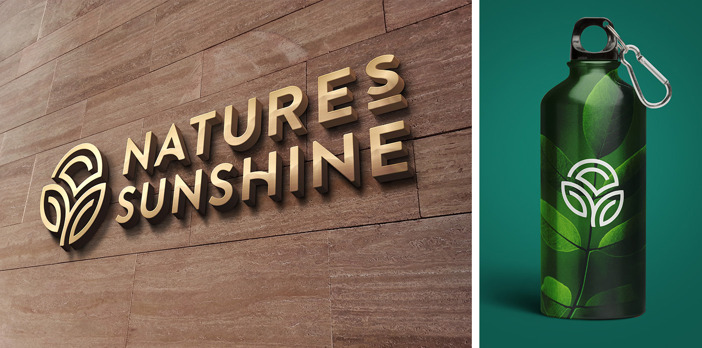
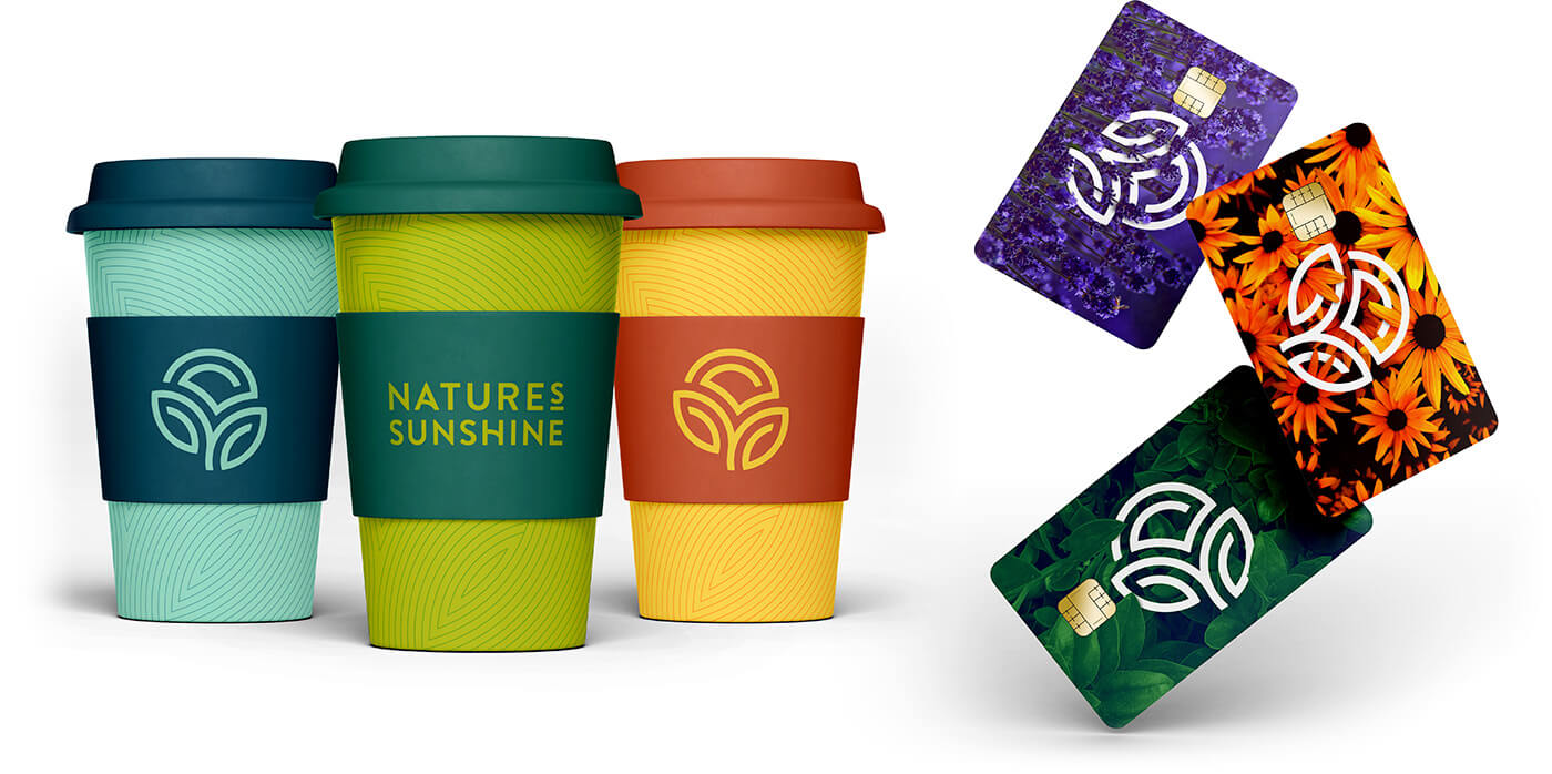
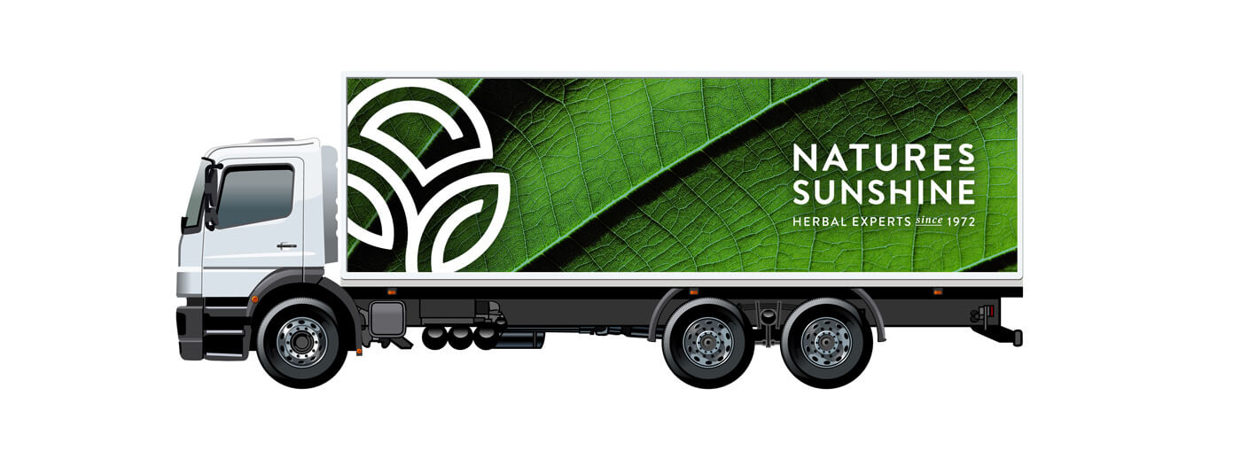
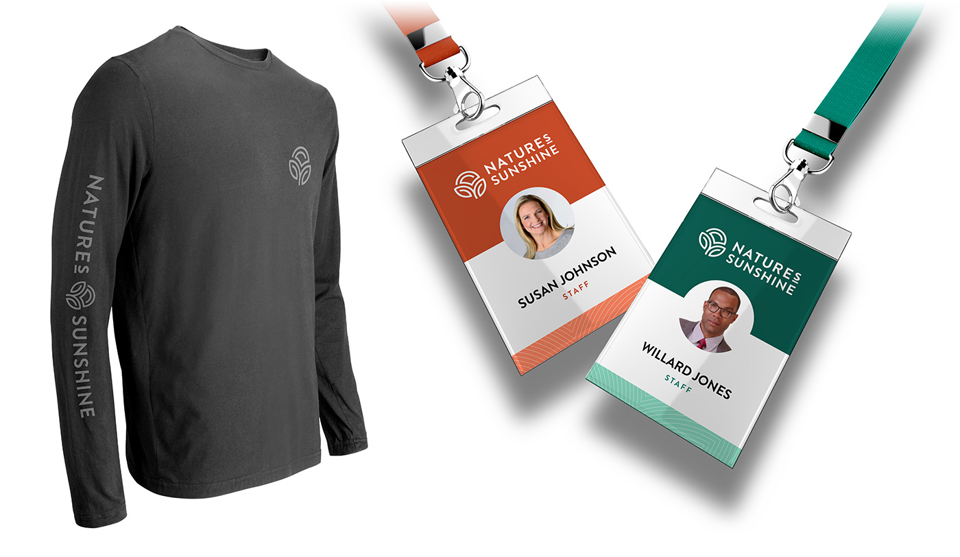
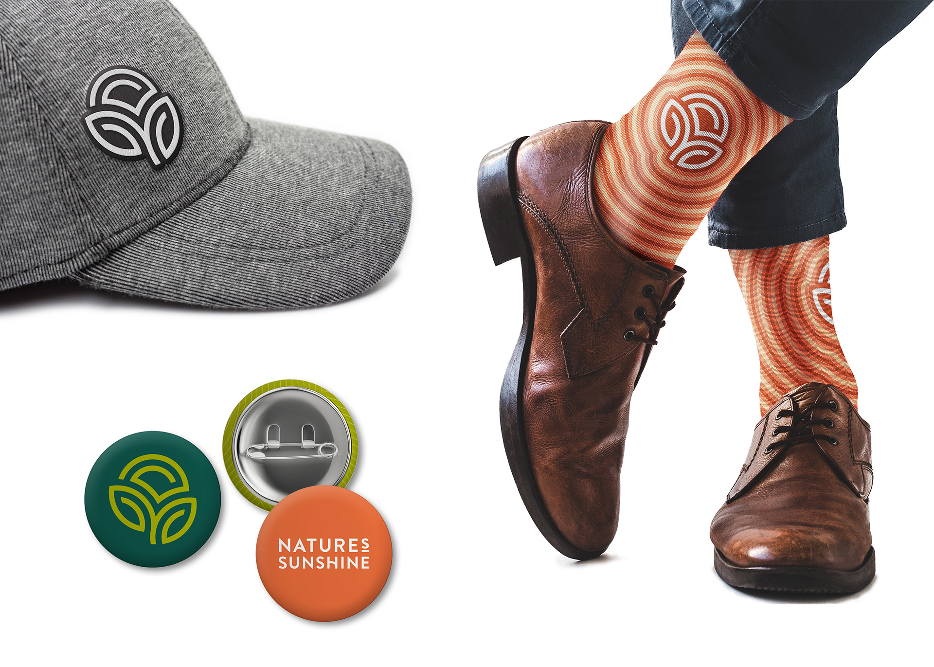
BRAND APPLICATION EXAMPLES
The following are examples of the visual brand being applied to various types of media.